Mobile SEO

With roughly a third of all website traffic today coming from mobile devices, you will annoy one in three people who visit your site if it doesn’t include responsive design or mobile optimisation. It gets even worse: soon, sites which aren’t mobile optimised just won’t show up in searches originated on smartphones and tablets, leaving you further out in the cold.
That’s because Google has recognised the fact that sending people to difficult-to-navigate sites doesn’t meet their information needs. As a result, as of 21 April, Google will make mobile optimisation a factor in mobile search results; it won’t rank non-mobile optimised sites for searches coming from tablets and smartphones.
If your site doesn’t incorporate responsive design (the ability to automatically adapt to the device accessing it) or isn’t mobile optimised, you could by default be excluding one third of the people who are trying to find you.
As mobile devices increasingly proliferate and grow in capability, it is likely that the ‘mobile internet’ will continue to grow. This drives home the necessity to consider mobile optimisation or responsive design as an imperative.
Establishing your site’s ‘mobile credentials’ is easy – just use Google’s Mobile-Friendly test:
www.google.com/webmasters/tools/mobile-friendly/
If it comes back like this, you’ve got nothing to worry about:
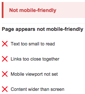
However, if it comes back looking like this:

Then it may be necessary to consider investing in responsive design or mobile optimisation of your website. If you don’t, there is a strong likelihood that site traffic will start to drop off after the 21st April.
– Gabriel Long, Digital Strategist
